StatsNotebook
Barchart
Follow our Facebook page or our developer’s Twitter for more tutorials and future updates.
The tutorial is based on R and StatsNotebook, a graphical interface for R.
Bar chart can be used to visualise the frequency or proportion of categorical variables. StatsNotebook uses the geom_bar() from ggplot2 to build bar chart.
We use the built-in alcohol dataset in this example. This dataset can be loaded into StatsNotebook using instruction here. This is a simulated data of alcohol consumption from 3666 individuals.
This dataset can also be loaded using the following codes
library(tidyverse)
currentDataset <- read_csv("https://statsnotebook.io/blog/data_management/example_data/alcohol.csv")
We will use the following three variables from this dataset
- alcohol - Number of standard drinks consumed in a month
- Remoteness - Capital city or regional area
- State - Seven states/territories in Australia: Queensland, New South Wales, Northern Territory, South Australia, Tasmania, Victoria and Western Australia.
In this example, we will build
Simple bar chart
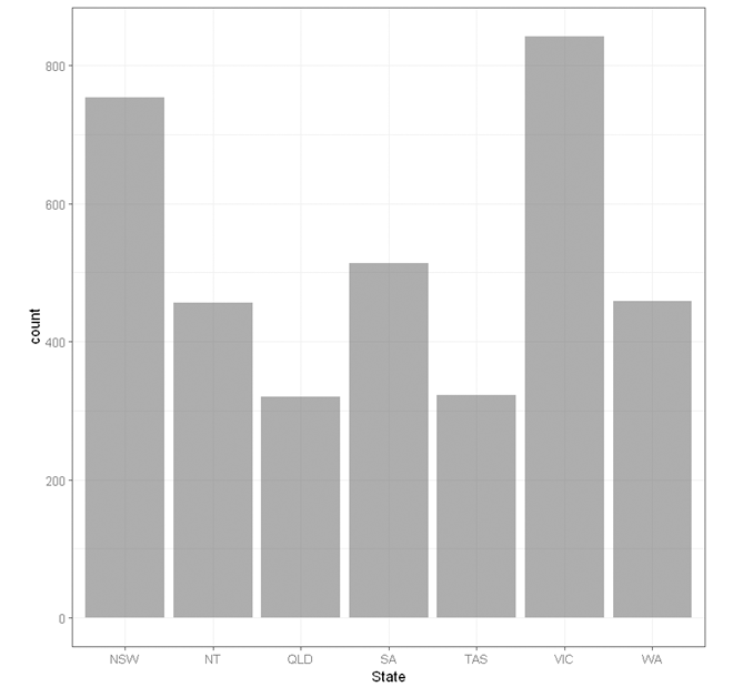
To build a simple bar chart for a single categorical variable (e.g. state),
- Click DataViz at the top
- Click Numeric
- Select Bar Chart from the menu
- In the bar chart panel, select State to Horizontal Axis.
- State is a categorical variable. If it is not yet coded as factor, you will need to manually covert it into a factor variable.
- Click Code and Run.
currentDataset %>%
  drop_na(State) %>%
  ggplot(aes(x = State)) +
  geom_bar(alpha = 0.6, na.rm = TRUE)+
    scale_fill_brewer(palette = "Set2")+
    scale_color_brewer(palette = "Set2")+
    theme_bw(base_family = "sans")+
    theme(legend.position = "bottom")


"Chan, G. and StatsNotebook Team (2020). StatsNotebook. (Version 0.1.0) [Computer Software]. Retrieved from https://www.statsnotebook.io"
"R Core Team (2020). The R Project for Statistical Computing. [Computer software]. Retrieved from https://r-project.org"
"Wickham H (2016). ggplot2: Elegant Graphics for Data Analysis. Springer-Verlag New York. ISBN 978-3-319-24277-4, https://ggplot2.tidyverse.org"
Output from the above R codes
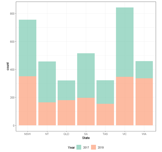
Stacked bar chart
To build a stacked bar chart for a single categorical variable (e.g. State) by another categorical variable (e.g. Year),
- Click DataViz at the top
- Click Numeric
- Select Bar Chart from the menu
- In the bar chart panel, select State to Horizontal Axis and select Year to Split by: Fill color.
- State and Year are categorical variables. If they are not yet coded as factor, you will need to manually covert it into a factor variable.
- Click Code and Run.
currentDataset %>%
  drop_na(State, Year) %>%
  ggplot(aes(x = State, fill = Year)) +
  geom_bar(alpha = 0.6, na.rm = TRUE)+
    scale_fill_brewer(palette = "Set2")+
    scale_color_brewer(palette = "Set2")+
    theme_bw(base_family = "sans")+
    theme(legend.position = "bottom")


"Chan, G. and StatsNotebook Team (2020). StatsNotebook. (Version 0.1.0) [Computer Software]. Retrieved from https://www.statsnotebook.io"
"R Core Team (2020). The R Project for Statistical Computing. [Computer software]. Retrieved from https://r-project.org"
"Wickham H (2016). ggplot2: Elegant Graphics for Data Analysis. Springer-Verlag New York. ISBN 978-3-319-24277-4, https://ggplot2.tidyverse.org"
Output from the above R codes
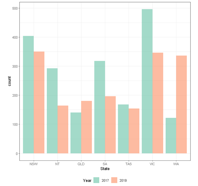
Grouped bar chart
To build a grouped bar chart for a single categorical variable (e.g. State) by another categorical variable (e.g. Year),
- Click DataViz at the top
- Click Numeric
- Select Bar Chart from the menu
- In the bar chart panel, select State to Horizontal Axis and select Year to Split by: Fill color.
- State and Year are categorical variables. If they are not yet coded as factor, you will need to manually covert it into a factor variable.
- Expaned the Bar Chart Setting panel, check Separate bars by Year.
- Click Code and Run.
currentDataset %>%
  drop_na(State, Year) %>%
  ggplot(aes(x = State, fill = Year)) +
  geom_bar(alpha = 0.6, na.rm = TRUE, position = "fill")+
    scale_fill_brewer(palette = "Set2")+
    scale_color_brewer(palette = "Set2")+
    theme_bw(base_family = "sans")+
    theme(legend.position = "bottom")


"Chan, G. and StatsNotebook Team (2020). StatsNotebook. (Version 0.1.0) [Computer Software]. Retrieved from https://www.statsnotebook.io"
"R Core Team (2020). The R Project for Statistical Computing. [Computer software]. Retrieved from https://r-project.org"
"Wickham H (2016). ggplot2: Elegant Graphics for Data Analysis. Springer-Verlag New York. ISBN 978-3-319-24277-4, https://ggplot2.tidyverse.org"
Output from the above R codes
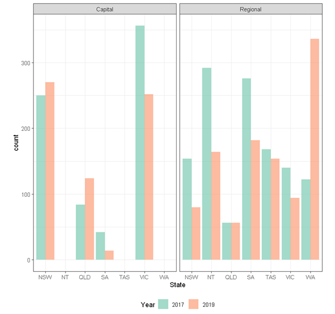
Multiple bar charts
To build multiple grouped bar charts for a single categorical variable (e.g. State) by a categorical variable (e.g. Year) in different facet by another categorical variable (e.g. Remoteness),
- Click DataViz at the top
- Click Numeric
- Select Bar Chart from the menu
- In the bar chart panel, select State to Horizontal Axis, Year to Split by: Fill color, and Remoteness to Facet.
- State, Year and Remoteness are categorical variables. If they are not yet coded as factor, you will need to manually covert it into a factor variable.
- Expaned the Bar Chart Setting panel, check Fill Chart.
- Click Code and Run.
currentDataset %>%
  drop_na(State, Year, Remoteness) %>%
  ggplot(aes(x = State, fill = Year)) +
  geom_bar(alpha = 0.6, na.rm = TRUE, position = "dodge")+
    scale_fill_brewer(palette = "Set2")+
    scale_color_brewer(palette = "Set2")+
    facet_wrap( ~ Remoteness)+
    theme_bw(base_family = "sans")+
    theme(legend.position = "bottom")


"Chan, G. and StatsNotebook Team (2020). StatsNotebook. (Version 0.1.0) [Computer Software]. Retrieved from https://www.statsnotebook.io"
"R Core Team (2020). The R Project for Statistical Computing. [Computer software]. Retrieved from https://r-project.org"
"Wickham H (2016). ggplot2: Elegant Graphics for Data Analysis. Springer-Verlag New York. ISBN 978-3-319-24277-4, https://ggplot2.tidyverse.org"
Output from the above R codes
Follow our Facebook page or our developer’s Twitter for more tutorials and future updates.