StatsNotebook
Correlogram
Follow our Facebook page or our developer’s Twitter for more tutorials and future updates.
The tutorial is based on R and StatsNotebook, a graphical interface for R.
Correlogram is a type of chart that visualise the pairwise association between variables. StatsNotebook uses the ggpairs() function from the GGally library to build correlogram. A publication ready correlogram can be built within a few minutes with StatsNotebook.
We use the built-in Personality dataset in this example. This dataset can be loaded into StatsNotebook using instruction here or can be downloaded from here.
This dataset can also be loaded using the following codes
library(tidyverse)
currentDataset <- read_csv("https://statsnotebook.io/blog/data_management/example_data/personality.csv")
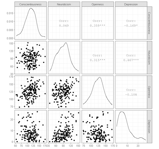
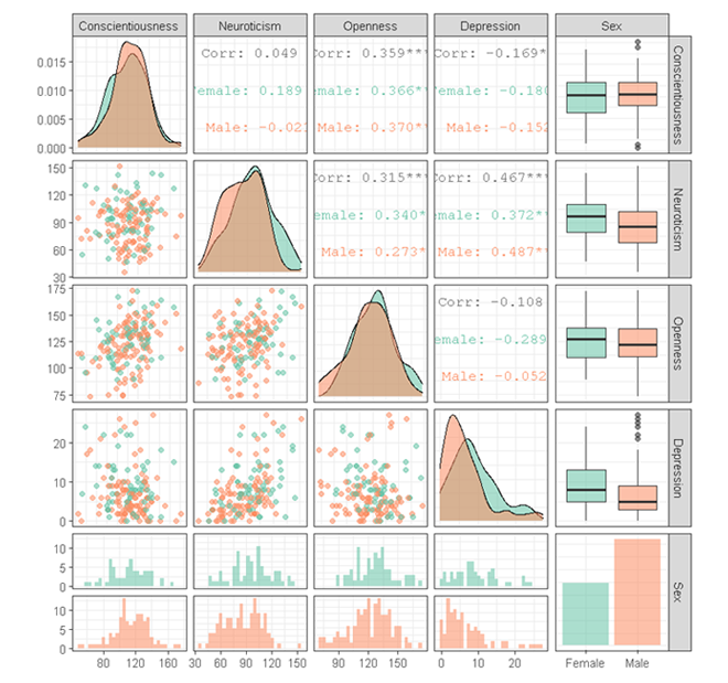
In this example, we will build a simple correlogram to visualise the relationship between four variables (three personality variables: Conscientiousness, Neuroticism, Openness and one mental health variable: Depression). We then build a correlogram by Sex (Male and Female.)
Correlogram (Scatterplot matrix)
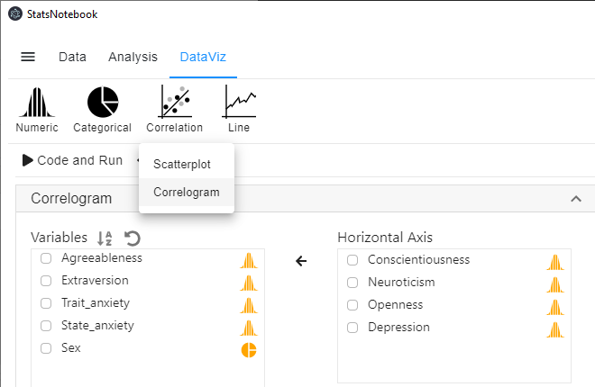
- Click DataViz at the top
- Click Correlation
- Select Correlogram from the menu
- In the Correlogram panel, select Conscientiousness, Neuroticism, Openness, and Depression from the Variables (left) to Horizontal Axis (right).

R Codes
library(GGally)

currentDataset %>%
  drop_na(Conscientiousness, Neuroticism, Openness, Depression) %>%
  select(Conscientiousness, Neuroticism, Openness, Depression) %>%
  ggpairs(progress = FALSE)+
    scale_fill_brewer(palette = "Set2")+
    scale_color_brewer(palette = "Set2")+
    theme_bw(base_family = "sans")


"Chan, G. and StatsNotebook Team (2020). StatsNotebook. (Version 0.1.0) [Computer Software]. Retrieved from https://www.statsnotebook.io"
"R Core Team (2020). The R Project for Statistical Computing. [Computer software]. Retrieved from https://r-project.org"
"Wickham H (2016). ggplot2: Elegant Graphics for Data Analysis. Springer-Verlag New York. ISBN 978-3-319-24277-4, https://ggplot2.tidyverse.org"
Output from the above R codes

Correlogram (Scatterplot matrix) by group
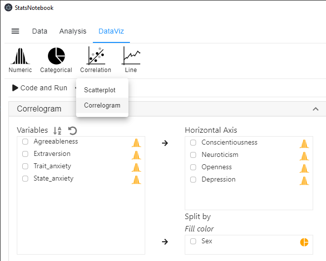
- Click DataViz at the top
- Click Correlation
- Select Correlogram from the menu
- In the Correlogram panel, select the Conscientiousness, Neuroticism, Openness, and Depression from the Variables (left) to Horizontal Axis (right).
- Select Sex to Split by: Fill color (right).
- Sex is a categorical variable. If it is not yet coded as factor, you will need to manually covert it into a factor variable.

R Codes
library(GGally)

currentDataset %>%
  drop_na(Conscientiousness, Neuroticism, Openness, Depression, Sex) %>%
  select(Conscientiousness, Neuroticism, Openness, Depression, Sex) %>%
  ggpairs(progress = FALSE,
  ggplot2::aes(alpha = 0.65, color = Sex))+
    scale_fill_brewer(palette = "Set2")+
    scale_color_brewer(palette = "Set2")+
    theme_bw(base_family = "sans")


"Chan, G. and StatsNotebook Team (2020). StatsNotebook. (Version 0.1.0) [Computer Software]. Retrieved from https://www.statsnotebook.io"
"R Core Team (2020). The R Project for Statistical Computing. [Computer software]. Retrieved from https://r-project.org"
"Wickham H (2016). ggplot2: Elegant Graphics for Data Analysis. Springer-Verlag New York. ISBN 978-3-319-24277-4, https://ggplot2.tidyverse.org"
Output from the above R codes

Citation
Chan, G. and StatsNotebook Team (2020). StatsNotebook. [Computer Software]. Retrieved from https://www.statsnotebook.io
R Core Team (2020). The R Project for Statistical Computing. [Computer software]. Retrieved from https://r-project.org
Wickham H (2016). ggplot2: Elegant Graphics for Data Analysis. Springer-Verlag New York. ISBN 978-3-319-24277-4, https://ggplot2.tidyverse.org
Follow our Facebook page or our developer’s Twitter for more tutorials and future updates.