StatsNotebook
Animated plots
Follow our Facebook page or our developer’s Twitter for more tutorials and future updates.
The tutorial is based on R and StatsNotebook, a graphical interface for R.
Animated plots can be created using the gganimate package, an extension of the ggplot2 package.
We will use the built-in Gapminder dataset for scatterplot example and the COVID-19 data for the line graph, world map and barchart. This dataset can be loaded into StatsNotebook using instruction here. The UNDP data can be downloaded from here here and the COVID-19 data can also be downloaded from here here .
In this tutorial, we will build
Description of the Gapminder data
The Gapminder dataset is a dataset of 199 countries compiled from the United Nations Development Programme. This dataset will be used for the scatterplot examples. The following variables will be used.
- lifeExp - Life expectany in years
- gdpPercap - Gross domestic product per capita in US dollar (inflation adjusted)
- continent - Continent of the countries
- pop - Population size
- year - Year
- country - Country name
library(tidyverse)
currentDataset <- read_csv("https://statsnotebook.io/blog/data_management/example_data/gapminder.csv")
Description of the COVID-19 data
This is a data compiled by the Johns Hopkin University between 22nd Jan 2020 and 29th Dec 2020. This dataset will be used for the line graph, world map and barchart examples. The data is in wide format and will need to be rearranged into a long format. The following variables will be used.
- Country - Country name
- Lat - Latitude of the country
- Long - Longitude of the country
- Date - Date.
- total_case - Number of total case since 22/01/2020.
- new_case - Number of new cases each day.
This dataset can also be loaded using the following codes
library(tidyverse)
currentDataset <- read_csv("https://statsnotebook.io/blog/data_management/example_data/covid19_long.csv")
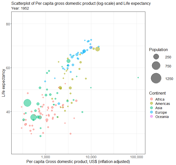
Animated scatterplot 1
In this example, we will use the Gapminder data To build a basis animated scatterplot visualising the association between two numerica variables (e.g. Life expectancy and Per capital GDP [in log scale]), and animate over a third variable (e.g. Year),
- Click DataViz at the top
- Click Correlation
- Select Scatterplot from the menu
- In the Scatterplot panel, select lifeExp to Vertical Axis, gdpPercap to Horizontal Axis and year to Frame.
- To show the data in different color, select continent to Fill color. We will need to code continent into factor because they are categorical variables. See Converting variable type for a step-by-step guide.
- To show the display the data point by population size, select pop to Size.
- Expand the Scatterplot panel
- check Log scale for the horizontal axis
- Set the width and height of the plot in pixels. In this example, both width and height are set to 700.
- Enter the file name of the plot, in this example, we set the file name to “animated_scatterplot”.
- To fine tune the plot, expand the Label, Settings and Theme panel
- Click Switch to Advanced Mode for customisable setting (e.g. font size, color schemes, etc).
- For Title, we will use “Scatterplot of Per capita gross domestic product (log-scale) and Life expectancy”
- For horizontal axis, we will use “Per capita gross domestic product, US$, (inflation adjusted)”
- For Vertical axis, we will use “Life expectancy”
- For Legends, we will set “Continent” as Color Fill Label and “Population” as Size label. We will also set the Legend position to “Right”.
- Click Code and Run.
R Codes
plot <- currentDataset %>%
  drop_na(continent, pop) %>%
  ggplot(aes(y = lifeExp, x = gdpPercap, size = pop)) +
    geom_jitter(alpha = 0.5, aes(color = continent), na.rm = TRUE)+
    scale_size(range = c(0.1, 8))+
    scale_x_log10()+
    theme_bw(base_family = "sans")+
    ggtitle("Scatterplot of Per capita gross domestic product (log-scale) and Life expectancy")+
    xlab("Per capita gross domestic product, US$, (inflation adjusted)")+
    ylab("Life expectancy")+
    labs(color = "Continent", fill = "Continent")+
    labs(size = "Population")
plot

library(gganimate)
library(gifski)

animated_plot <- plot + transition_time(year)+
    labs(subtitle = "year: {frame_time}")
animate(animated_plot, width = 700, height = 700, renderer = gifski_renderer())
anim_save("animated_scatterplot.gif", animation = last_animation())
paste("Animated plot saved at ", getwd())
Output from the above R codes

Further customisation with manual codings
First, we can adjust the scale of population to million by changing the line
ggplot(aes(y = lifeExp, x = gdpPercap, size = pop)) +
to
ggplot(aes(y = lifeExp, x = gdpPercap, size = pop/1000000)) +
To reflect the new scale, we change the legend label by changing the line
labs(size = "Population")+
to
labs(size = "Population (millions)")+
Second, we can adjust the size of the bubble and break point of the legend by changing the line
scale_size(range = c(0.1, 8))+
to
scale_size(range = c(2, 20), breaks = c(250,750,1250))+
The smallest bubble will now have a size of 2 and the largest one will have a size of 20. The break point of the legend will be at 250, 750 and 1250 (millions).
Third, we can change the number presentation in the x-axis from scientic notation to normal by changing the line
scale_x_log10()+
to
scale_x_log10(labels = scales::comma)+
Forth, we can adjust the size of the font in various section of the plots (e.g. title, x-axis/y-axis title, etc) by adding the following codes at the end of the ggplot function. We will need to also add the + sign to the previous line of code to concatenate the codes for the ggplot function. The last line of code is to adjust the size of the color legend.
    theme(plot.title = element_text(size = 16))+
    theme(plot.subtitle = element_text(size = 14))+
    theme(axis.title.x = element_text(size = 16))+
    theme(axis.title.y = element_text(size = 16))+
    theme(axis.text.x = element_text(size = 14))+
    theme(axis.text.y = element_text(size = 14))+
    theme(legend.title = element_text(size = 16))+
    theme(legend.text = element_text(size = 14))+
    guides(color = guide_legend(override.aes = list(size=5)))
Complete R codes
plot <- currentDataset %>%
  drop_na(continent, pop) %>%
  ggplot(aes(y = lifeExp, x = gdpPercap, size = pop/1000000)) +
    geom_jitter(alpha = 0.5, aes(color = continent), na.rm = TRUE)+
    scale_size(range = c(2, 20), breaks = c(250,750,1250))+
    scale_x_log10(labels = scales::comma)+
    theme_bw(base_family = "sans")+
    ggtitle("Scatterplot of Per capita gross domestic product (log-scale) and Life expectancy")+
    xlab("Per capita Gross domestic product, US$ (inflation adjusted)")+
    ylab("Life expectancy")+
    labs(color = "Continent", fill = "Continent")+
    labs(size = "Population (millions)")+
    theme(plot.title = element_text(size = 16))+
    theme(plot.subtitle = element_text(size = 14))+
    theme(axis.title.x = element_text(size = 16))+
    theme(axis.title.y = element_text(size = 16))+
    theme(axis.text.x = element_text(size = 14))+
    theme(axis.text.y = element_text(size = 14))+
    theme(legend.title = element_text(size = 16))+
    theme(legend.text = element_text(size = 14))+
    guides(color = guide_legend(override.aes = list(size=5)))
plot

library(gganimate)
library(gifski)

animated_plot <- plot + transition_time(year)+
    labs(subtitle = "Year: {frame_time}")
animate(animated_plot, width = 700, height = 656, renderer = gifski_renderer())
anim_save("animated_scatterplot.gif", animation = last_animation())
paste("Animated plot saved at ", getwd())
Output from the above R codes

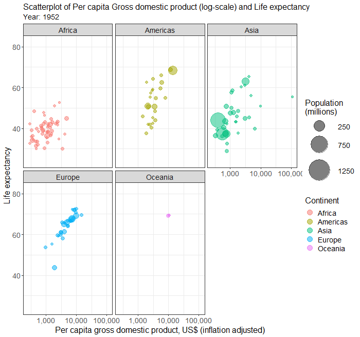
Animated scatterplot 2
To plot different continent in different sub-plot, follow the above steps and add the following line to the ggplot function. Depending the position you insert this line, you will need to add a + sign to the previous line and also the end of this line.
facet_wrap( ~ continent)
R codes
Below is the complete R codes.
plot <- currentDataset %>%
  drop_na(continent, pop) %>%
  ggplot(aes(y = lifeExp, x = gdpPercap, size = pop/1000000)) +
    geom_jitter(alpha = 0.5, aes(color = continent), na.rm = TRUE)+
    scale_size(range = c(2, 20), breaks = c(250,750,1250))+
    facet_wrap( ~ continent)+
    scale_x_log10(labels = scales::comma)+
    theme_bw(base_family = "sans")+
    ggtitle("Scatterplot of Per capita gross domestic product (log-scale) and Life expectancy")+
    xlab("Per capita Gross domestic product, US$ (inflation adjusted)")+
    ylab("Life expectancy")+
    labs(color = "Continent", fill = "Continent")+
    labs(size = "Population (millions)")+
    theme(plot.title = element_text(size = 16))+
    theme(plot.subtitle = element_text(size = 14))+
    theme(axis.title.x = element_text(size = 16))+
    theme(axis.title.y = element_text(size = 16))+
    theme(axis.text.x = element_text(size = 14))+
    theme(axis.text.y = element_text(size = 14))+
    theme(legend.title = element_text(size = 16))+
    theme(legend.text = element_text(size = 14))+
    guides(color = guide_legend(override.aes = list(size=5)))
plot

library(gganimate)
library(gifski)

animated_plot <- plot + transition_time(year)+
    labs(subtitle = "Year: {frame_time}")
animate(animated_plot, width = 700, height = 656, renderer = gifski_renderer())
anim_save("animated_scatterplot.gif", animation = last_animation())
paste("Animated plot saved at ", getwd())
Output from the above R codes

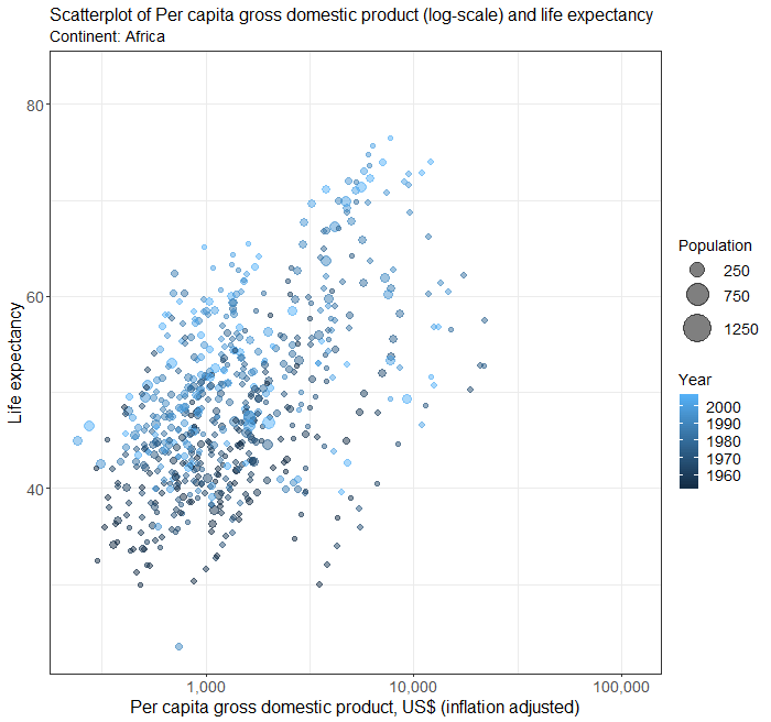
Animated scatterplot 3
To show year in different color and continents in different frame, the steps will be very similar to those in the above examples, except that now we select year into Fill color and continent into Frame.
Complete R Codes
In the codes below, we have also included all the customisation codes from above.
plot <- currentDataset %>%
  drop_na(year, pop) %>%
  ggplot(aes(y = lifeExp, x = gdpPercap, size = pop/1000000)) +
    geom_jitter(alpha = 0.5, aes(color = year), na.rm = TRUE)+
    scale_size(range = c(2, 12), breaks = c(250,750,1250))+
    scale_x_log10(labels = scales::comma)+
    theme_bw(base_family = "sans")+
    ggtitle("Scatterplot of Per capita gross domestic product (log-scale) and life expectancy")+
    xlab("Per capita gross domestic product, US$ (inflation adjusted)")+
    ylab("Life expectancy")+
    labs(color = "Year", fill = "Year")+
    labs(size = "Population")+
    theme(plot.title = element_text(size = 16))+
    theme(plot.subtitle = element_text(size = 14))+
    theme(axis.title.x = element_text(size = 16))+
    theme(axis.title.y = element_text(size = 16))+
    theme(axis.text.x = element_text(size = 14))+
    theme(axis.text.y = element_text(size = 14))+
    theme(legend.title = element_text(size = 14))+
    theme(legend.text = element_text(size = 14))
plot

library(gganimate)
library(gifski)

animated_plot <- plot + transition_states(continent, transition_length = 1, state_length = 2)+
    labs(subtitle = "Continent: {closest_state}") +
    enter_fade()+
    exit_shrink()
animate(animated_plot, width = 700, height = 656, renderer = gifski_renderer())
anim_save("animated_scatterplot.gif", animation = last_animation())
paste("Animated plot saved at ", getwd())
Output from the above R codes

Animated line graph
Animated line graph is often used to show the evoluation of a time series. Creating an animated line graph in StatsNotebook is similar to creating a static line graph. In this example, we limit the data to Australia and New Zealand. To do this, we will need to run the following codes after loading the data.
currentDataset <- currentDataset %>%
    filter(Country %in% c("Australia", "New Zealand"))
To create a line graph showing the number of new COVID-19 cases in Australia and New Zealand, we can
- Click DataViz at the top
- Click Line
- Select Line graph/ Time Series
- In the Line graph panel, select new_case to Vertical Axis, date to Horizontal axis and Country to Fill color.
- We will need to code Country into factor because they are categorical variables. See Converting variable type for a step-by-step guide.
- Expand the Line Graph Setting panel, check Animate
- We can set the Width and Height for your animated plot. In this example, we use 700 for width and 656 for height.
- We can also set the file name of the plot.
- To set the title, horizontal and vertical axis and font size, we can expand the Label and Theme panel, and
- Click on Switch to Advanced mode and set the corresponding attributes.
- Click Code and Run.
R codes
plot <- currentDataset %>%
  ggplot(aes(y = new_case, x = date, color = Country)) +
    geom_line(na.rm = TRUE, size = 1, alpha = 0.8)+
    theme_bw(base_family = "sans")+
    theme(legend.position = "bottom")+
    ggtitle("# of new COVID19 cases")+
    xlab("Date")+
    ylab("# of new cases")+
    labs(color = "Country")+
    theme(plot.title = element_text(size = 16))+
    theme(plot.subtitle = element_text(size = 14))+
    theme(axis.title.x = element_text(size = 16))+
    theme(axis.title.y = element_text(size = 16))+
    theme(axis.text.x = element_text(size = 14))+
    theme(axis.text.y = element_text(size = 14))+
    theme(legend.title = element_text(size = 14))+
    theme(legend.text = element_text(size = 14))
plot

library(gganimate)
library(gifski)

animated_plot <- plot + transition_reveal(date)

animate(animated_plot, width = 700, height = 656, renderer = gifski_renderer())
anim_save("animated_linegraph.gif", animation = last_animation())
paste("Animated plot saved at ", getwd())
Output from the above R codes

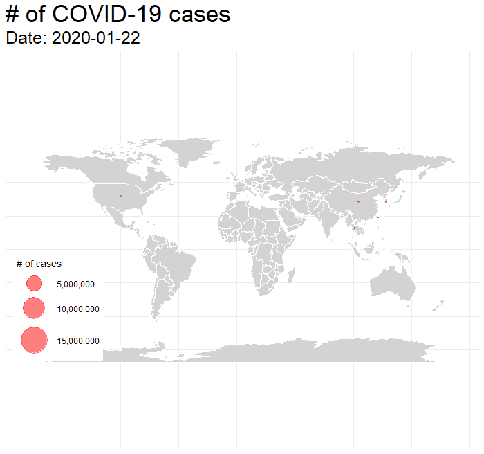
Animated world map
Point-and-click menu for plotting world map is not yet available in StatsNotebook. To draw the boundary of each countries, we will use world map data returned by the map_data from ggplot2. After loading the COVID-19 data, we run the following code to load the world map data into the variable world_map.
world_map <- map_data("world")
We then only retain rows with 1 or more cases by using the following line.
currentDataset <- currentDataset %>%
  filter(total_case > 0)
We will use the geom_polygon function to draw the boundary of each country based on the latitude and longitude data from the variable world_map. We use the size of the data point to represent the number of total cases in each country by using the size aesthetic. Finally, we use the theme function to setup the canvas for plotting maps with ggplot.
We use the following codes to set up the plot.
plot <- ggplot() +
  geom_polygon(data = world_map, fill = "lightgray", color = "white", aes(x = long, y = lat, group = group)) +
  geom_point(data = covid19_long, aes(x = Long, y = Lat, size = total_case), alpha = 0.5, fill = "red", color = "red") +
  scale_size_continuous(range = c(1, 20), labels = scales::comma) +
  theme_bw() +
  theme(axis.ticks = element_blank(),
        axis.line = element_blank(),
        axis.title = element_blank(),
        axis.text = element_blank(),
        panel.border = element_blank(),
        plot.title = element_text(size = 35),
        plot.subtitle = element_text(size = 25),
        legend.position = c(0.02,0.08),
        legend.justification = c(0.02,0.08),
        legend.title = element_text(size = 14),
        legend.text = element_text(size = 12)) +
  labs(size = "# of cases")
We then use the transition_states function from the gganimate library to specify the transition to be based on the data variable.
library(gganimate)
library(gifski)

animated_plot <- plot + transition_states(date, transition_length = 1, state_length = 1) +
  labs(title = "# of COVID-19 cases",
       subtitle = "Date: {closest_state}")
Lastly, we use the animate function to create the animated plot. We can use the weight and height parameter to set the size of the plot. we can use the nframes parameter to set the total number of frame in the animation, and the fps parameter to set the frame per second. We then use the anim_save function to save the plot.
animate(animated_plot, nframes=800, fps = 30, width = 1200, height = 800, renderer = gifski_renderer())

anim_save("tmp_map.gif", animation = last_animation())
Complete R codes
Suppose the COVID-19 data was alreadly loaded into the dataframe currentDataset, the following is the complete code for creating an animated world map showing the evolution of COVID-19 around the world.
world_map <- map_data("world")

currentDataset <- currentDataset %>%
  filter(total_case > 0)

plot <- ggplot() +
  geom_polygon(data = world_map, fill = "lightgray", color = "white", aes(x = long, y = lat, group = group)) +
  geom_point(data = currentDataset, aes(x = Long, y = Lat, size = total_case), alpha = 0.5, fill = "red", color = "red") +
  scale_size_continuous(range = c(1, 20), labels = scales::comma) +
  theme_bw() +
  theme(axis.ticks = element_blank(),
        axis.line = element_blank(),
        axis.title = element_blank(),
        axis.text = element_blank(),
        panel.border = element_blank(),
        plot.title = element_text(size = 35),
        plot.subtitle = element_text(size = 25),
        legend.position = c(0.02,0.08),
        legend.justification = c(0.02,0.08),
        legend.title = element_text(size = 14),
        legend.text = element_text(size = 12)) +
  labs(size = "# of cases")

library(gganimate)
library(gifski)

animated_plot <- plot + transition_states(date, transition_length = 1, state_length = 1) +
  labs(title = "# of COVID-19 cases",
       subtitle = "Date: {closest_state}")

animate(animated_plot, nframes=800, fps = 30, width = 1200, height = 800, renderer = gifski_renderer())

anim_save("tmp_map.gif", animation = last_animation())
Output from the above R codes

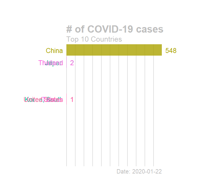
Animated bar chart
Point-and-click menu for creating racing barchart is not yet available in StatsNotebook. Both the geom_bar and geom_tile can be used to create animated bar chart. In this example, we use geom_tile. After loading the COVID-19 data, we run the following code to rank the countries by number of tocal COVID cases on each day, and only retain the top ten countries on each day.
currentDataset <- currentDataset %>%
    group_by(date) %>%
    mutate(rank = rank(-total_case)) %>%
    group_by(Country) %>%
    filter(rank <= 10) %>%
    ungroup()

currentDataset$rank <- round(currentDataset$rank)
We then use the following codes to create the plot. We use geom_text to add the country name and number of cases at the front and end of the bars. We use coord_flip to flip the coordinate system to create the horizontal bars.
plot = currentDataset %>%
ggplot(aes(rank, group = Country,
                fill = Country, color = Country)) +
  geom_tile(aes(y = total_case/2,
                height = total_case,
                width = 0.9), alpha = 0.8, color = NA) +
  geom_text(aes(y = 0, label = paste(Country, " ")), hjust = 1, size = 8) +
  geom_text(aes(y=total_case,label = paste(" ", total_case), ), hjust=0, size = 8) +
  coord_flip(clip = "off", expand = FALSE) +
  scale_y_continuous(labels = scales::comma) +
  scale_x_reverse() +
  guides(color = FALSE, fill = FALSE) +
  theme(axis.line = element_blank(),
        axis.text.x = element_blank(),
        axis.text.y = element_blank(),
        axis.ticks = element_blank(),
        axis.title.x = element_blank(),
        axis.title.y = element_blank(),
        legend.position = "none",
        panel.background = element_blank(),
        panel.border = element_blank(),
        panel.grid.major = element_blank(),
        panel.grid.minor = element_blank(),
        panel.grid.major.x = element_line( size=.1, color="gray" ),
        panel.grid.minor.x = element_line( size=.1, color="gray" ),
        plot.title  = element_text(size=35, face="bold", colour="gray"),
        plot.subtitle = element_text(size=25, color="gray"),
        plot.caption = element_text(size=20, color="gray"),
        plot.background=element_blank(),
        plot.margin = margin(3,5, 2, 8, "cm"))
We then use the transition_states function from the gganimate library to specify the transition to be based on the date variable. Since this is not a typical use of the geom_tile function and R would issue warnings about its use. We disable the warnings in the first line.
options(warn = -1)

library(gganimate)
library(gifski)

animated_plot <-plot + transition_states(date, transition_length = 3, state_length = 1) +
  view_follow(fixed_x = TRUE)  +
  labs(title = "# of COVID-19 cases",
       subtitle  =  "Top 10 Countries",
       caption = "Date: {closest_state}")
Lastly, we use the animate function to create the animated plot. We can use the weight and height parameter to set the size of the plot. we can use the nframes parameter to set the total number of frame in the animation, and the fps parameter to set the frame per second. We then use the anim_save function to save the plot.
animate(animated_plot, nframes=1200, fps = 20, width = 700, height = 656, renderer = gifski_renderer())

anim_save("tmp.gif", animation = last_animation())
Complete R codes
currentDataset <- currentDataset %>%
    group_by(date) %>%
    mutate(rank = rank(-total_case)) %>%
    group_by(Country) %>%
    filter(rank <= 10) %>%
    ungroup()

currentDataset$rank <- round(currentDataset$rank)

plot = currentDataset %>%
ggplot(aes(rank, group = Country,
                fill = Country, color = Country)) +
  geom_tile(aes(y = total_case/2,
                height = total_case,
                width = 0.9), alpha = 0.8, color = NA) +
  geom_text(aes(y = 0, label = paste(Country, " ")), hjust = 1, size = 8) +
  geom_text(aes(y=total_case,label = paste(" ", total_case), ), hjust=0, size = 8) +
  coord_flip(clip = "off", expand = FALSE) +
  scale_y_continuous(labels = scales::comma) +
  scale_x_reverse() +
  guides(color = FALSE, fill = FALSE) +
  theme(axis.line = element_blank(),
        axis.text.x = element_blank(),
        axis.text.y = element_blank(),
        axis.ticks = element_blank(),
        axis.title.x = element_blank(),
         axis.title.y = element_blank(),
        legend.position = "none",
        panel.background = element_blank(),
        panel.border = element_blank(),
        panel.grid.major = element_blank(),
        panel.grid.minor = element_blank(),
        panel.grid.major.x = element_line( size=.1, color="gray" ),
        panel.grid.minor.x = element_line( size=.1, color="gray" ),
        plot.title  = element_text(size=35, face="bold", colour="gray"),
        plot.subtitle = element_text(size=25, color="gray"),
        plot.caption = element_text(size=20, color="gray"),
        plot.background=element_blank(),
       plot.margin = margin(3,5, 2, 8, "cm"))

library(gganimate)
library(gifski)

options(warn = -1)
animated_plot <-plot + transition_states(date, transition_length = 3, state_length = 1) +
  view_follow(fixed_x = TRUE)  +
  labs(title = "# of COVID-19 cases",
       subtitle  =  "Top 10 Countries",
       caption = "Date: {closest_state}")
animate(animated_plot, nframes=1200, fps = 20, width = 700, height = 656, renderer = gifski_renderer())

anim_save("tmp.gif", animation = last_animation())
Output from the above R codes

Follow our Facebook page or our developer’s Twitter for more tutorials and future updates.