StatsNotebook
Scatterplot
Follow our Facebook page or our developer’s Twitter for more tutorials and future updates.
The tutorial is based on R and StatsNotebook, a graphical interface for R.
Scatterplot can be used to visualise the association between two numeric variables. StatsNotebook uses the geom_jitter function from the ggplot2 library to build scatterplot.
We use the built-in UNDP dataset in this example. This dataset can be loaded into StatsNotebook using instruction here or can be downloaded from here . This is a dataset of 199 countries compiled from the United Nations Development Programme.
We will use the following three variables from this dataset
- HDI - Human Development Index in 2018
- GDP - Gross Domestic Product per capital in 2018
- Pop - Population (in millions) in 2018
- Continent - Continent
- Schooling - Expected years of schooling
This dataset can also be loaded using the following codes
library(tidyverse)
currentDataset <- read_csv("https://statsnotebook.io/blog/data_management/example_data/HDI_countries.csv")
In this example, we will build
Simple scatterplot
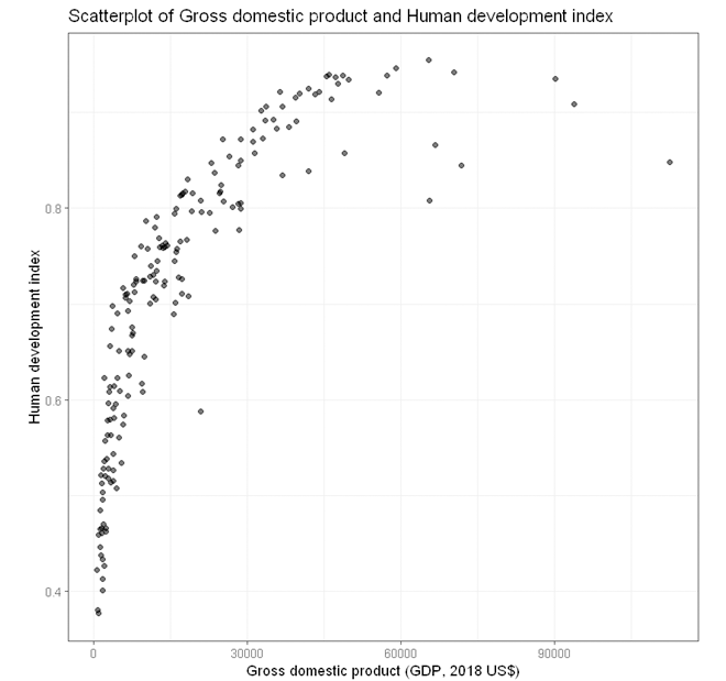
To build a simple scatterplot visualising association between two numeric variables (e.g. HDI and GDP),
- Click DataViz at the top
- Click Correlation
- Select Scatterplot from the menu
- In the Scatterplot panel, select HDI to Vertical Axis and GDP to Horizontal Axis.
- Expand the Scatterplot Setting panel and uncheck Add a fitted line (A line of best fit will be added to the plot by default).
- Expand the Label, Settings and Theme panel
- Click Switch to Advanced Mode for customisable setting (e.g. font size, color schemes, etc).
- For Title, we used “Scatterplot of Gross domestic product and Human development index”.
- For Horizontal axis, we used “Gross domestic product (GDP, 2018 US$)”.
- For Vertical axis, we used “Human development index”.
- Click Code and Run
R codes
currentDataset %>%
  ggplot(aes(y = HDI, x = GDP)) +
    geom_jitter(alpha = 0.6, na.rm = TRUE)+
    scale_fill_brewer(palette = "Set2")+
    scale_color_brewer(palette = "Set2")+
    theme_bw(base_family = "sans")+
    ggtitle("Scatterplot of Gross domestic product and Human development index")+
    xlab("Gross domestic product (GDP, 2018 US$)")+
    ylab("Human development index")+
    theme(legend.position = "bottom")
The variables for the vertial (y) and horizontal (x) are specified in the function ggplot. For scatterplot, we use geom_jitter instead of geom_point to add a small amount of noise to each point so that the points will not be overlapping with each other.
Output from the above R codes

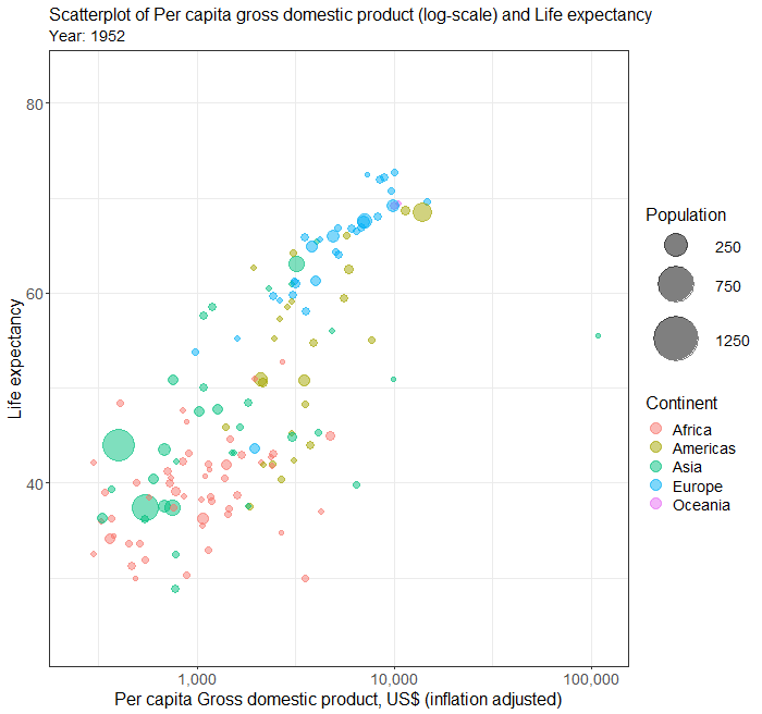
Bubble plot
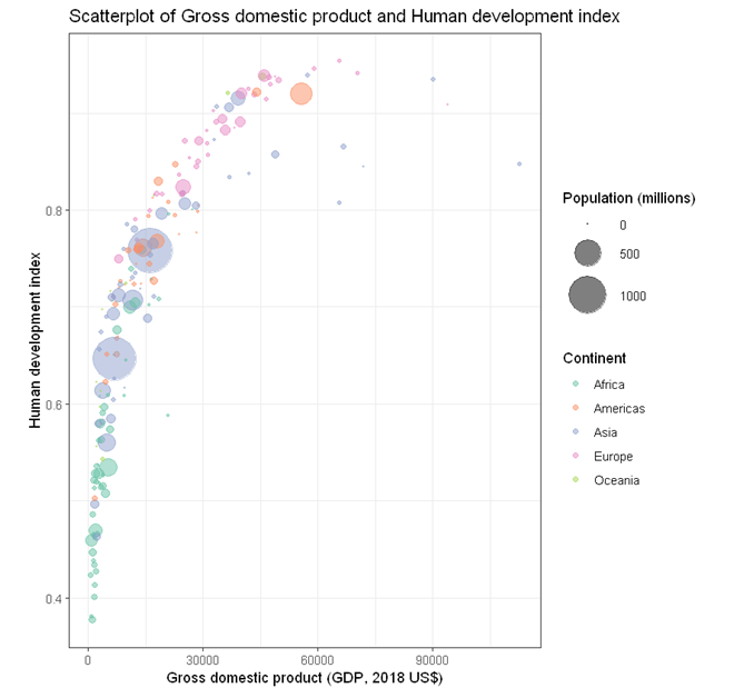
To build a bubble plot visualising the association between two numeric variables (e.g. HDI and GDP), with point size determined by a third continuous variable (e.g. Population size) and points color-coded by a categorical variable (e.g. continent)
- Click DataViz at the top
- Click Correlation
- Select Scatterplot from the menu
- In the Scatterplot panel, select HDI to Vertical Axis, GDP to Horizontal Axis, Continent to Fill color, and Pop to Size.
- Expand the Scatterplot Setting panel and uncheck Add a fitted line (A line of best fit will be added to the plot by default).
- Expand the Label, Settings and Theme panel
- Click Switch to Advanced Mode for customisable setting (e.g. font size, color schemes, etc).
- For Title, we used “Scatterplot of Gross domestic product and Human development index”.
- For Horizontal axis, we used “Gross domestic product (GDP, 2010 US$)”.
- For Vertical axis, we used “Human development index”.
- For Color fill label, we used “Continent”.
- For Size label, we used “Population (millions)”.
- Since we have two legends, one for Color and one for Size, we set legend position to “Right”.
- Click Code and Run
R codes
currentDataset %>%
  drop_na(Continent, Pop) %>%
  ggplot(aes(y = HDI, x = GDP, size = Pop)) +
    geom_jitter(alpha = 0.5, aes(color = Continent), na.rm = TRUE)+
    scale_size(range = c(0.1, 8))+
    scale_fill_brewer(palette = "Set2")+
    scale_color_brewer(palette = "Set2")+
    theme_bw(base_family = "sans")+
    ggtitle("Scatterplot of Gross domestic product and Human development index")+
    xlab("Gross domestic product (GDP, 2018 US$)")+
    ylab("Human development index")+
    labs(color = "Continent", fill = "Continent")+
    labs(size = "Population (millions)")+
    theme(legend.position = "bottom")
Output from the above R codes

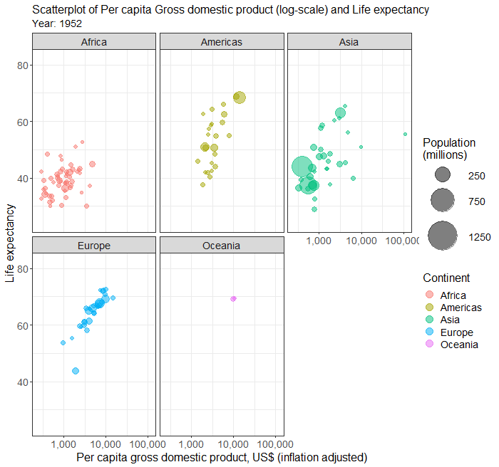
Changing legend position
Part of the legends is cut-off (bottom left) because we are running out of space. We can place the legend to the right hand size of the plot by changing the last line of codes.
theme(legend.position = "right")

Adjusting bubble size
The size of the bubble can be changed by changing the following line
scale_size(range = c(0.1, 8))
The minimum point size is 0.1 and the maximum is 8. The following code changes the minimum to 0.3 and the maximum to 15.
scale_size(range = c(0.3, 15))
Output from the updated R codes

Scatterplot with line of best fit
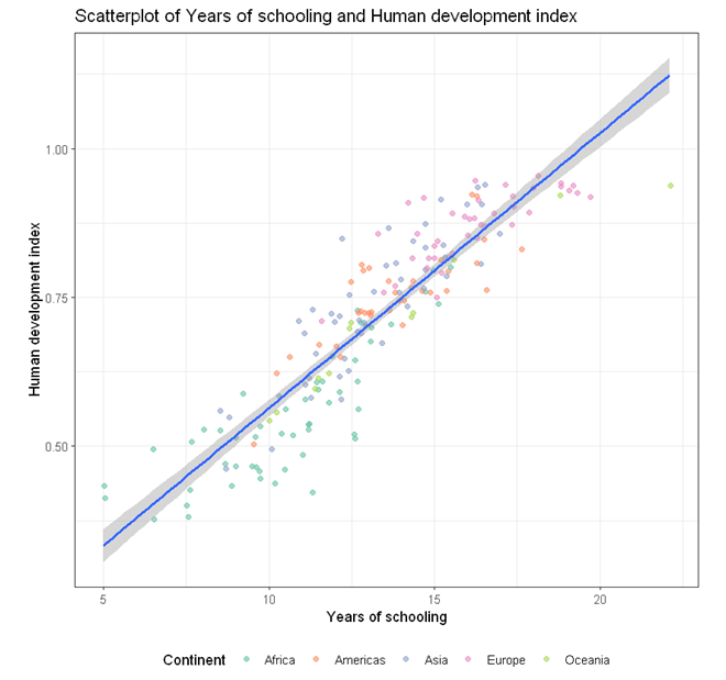
To build a scatterplot visualising the association between two numeric variables (e.g. HDI and Schooling) with points color-coded by a categorical variable (e.g. continent) and an overall line of best fit,
- Click DataViz at the top
- Click Correlation
- Select Scatterplot from the menu
- In the Scatterplot panel, select HDI to Vertical Axis, Schooling to Horizontal Axis, and Continent to Fill color.
- Expand the Scatterplot Setting panel
- check Add a fitted line (A line of best fit will be added to the plot by default).
- check By fill color.
- Expand the Label, Settings and Theme panel
- Click Switch to Advanced Mode for customisable setting (e.g. font size, color schemes, etc).
- For Title, we used “Scatterplot of Years of schooling and Human development index”.
- For Horizontal axis, we used “Years of schooling”.
- For Vertical axis, we used “Human development index”.
- For Color fill label, we used “Continent”.
- For Size label, we used “Population (millions)”.
- Since we have two legends, one for Color and one for Size, we set legend position to “Right”.
- Click Code and Run
R codes
currentDataset %>%
  drop_na(Continent) %>%
  ggplot(aes(y = HDI, x = Schooling)) +
    geom_jitter(alpha = 0.6, aes(color = Continent), na.rm = TRUE)+
    geom_smooth(method = "lm", se = TRUE, level = 0.95, na.rm = TRUE, show.legend = FALSE)+
    scale_fill_brewer(palette = "Set2")+
    scale_color_brewer(palette = "Set2")+
    theme_bw(base_family = "sans")+
    ggtitle("Scatterplot of Years of schooling and Human development index")+
    xlab("Years of schooling")+
    ylab("Human development index")+
    labs(color = "Continent", fill = "Continent")+
    theme(legend.position = "bottom")
In the above R codes, we have specified the vertial axis (y-axis) to be HDI and horizontal to be Schooling globally in the line
ggplot(aes(y = HDI, x = Schooling))
and then requested the points to be colored by Continent in the geom_jitter function.
geom_jitter(alpha = 0.6, aes(color = Continent), na.rm = TRUE)
To specify one line of best fit for each Continent, we can specified the color globally as shown in the following example.
Output from the above R codes

Scatterplot with line of best fit by groups
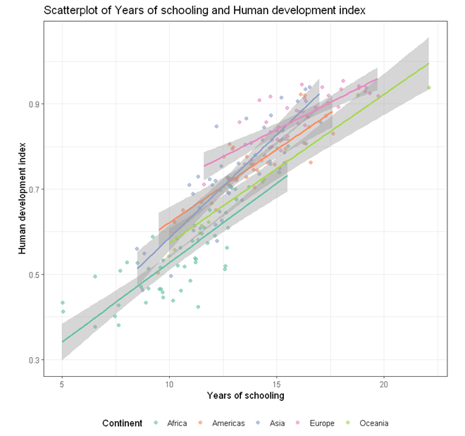
To build a scatterplot visualising the association between two numeric variables (e.g. HDI and Schooling) with a line of best fit and points color-coded by a categorical variable (e.g. continent),
- Click DataViz at the top
- Click Correlation
- Select Scatterplot from the menu
- In the Scatterplot panel, select HDI to Vertical Axis, Schooling to Horizontal Axis, and Continent to Fill color.
- Expand the Scatterplot Setting panel, check Add a fitted line (A line of best fit will be added to the plot by default).
- Expand the Label, Settings and Theme panel
- Click Switch to Advanced Mode for customisable setting (e.g. font size, color schemes, etc).
- For Title, we used “Scatterplot of Years of schooling and Human development index”.
- For Horizontal axis, we used “Years of schooling”.
- For Vertical axis, we used “Human development index”.
- For Color fill label, we used “Continent”.
- For Size label, we used “Population (millions)”.
- Since we have two legends, one for Color and one for Size, we set legend position to “Right”.
- Click Code and Run
R codes
currentDataset %>%
  drop_na(Continent) %>%
  ggplot(aes(y = HDI, x = Schooling, color = Continent)) +
    geom_jitter(alpha = 0.6, na.rm = TRUE)+
    geom_smooth(method = "lm", se = TRUE, level = 0.95, na.rm = TRUE, show.legend = FALSE)+
    scale_fill_brewer(palette = "Set2")+
    scale_color_brewer(palette = "Set2")+
    theme_bw(base_family = "sans")+
    ggtitle("Scatterplot of Years of schooling and Human development index")+
    xlab("Years of schooling")+
    ylab("Human development index")+
    labs(color = "Continent", fill = "Continent")+
    labs(size = "Population (millions)")+
    theme(legend.position = "bottom")
In this example, the color of the point is specified globally in the ggplot function
ggplot(aes(y = HDI, x = Schooling, color = Continent))
As a result, separate lines of best fit will be added for each continent.
Output from the above R codes

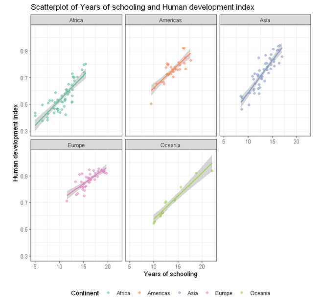
Scatterplots in multiple facets
The above plot of years of schooling and human development index is a bit busy. We can use the facet to plot separate scatterplots by continent by adding an extra line of codes.
facet_wrap( ~ Continent)
Below is the complete code for generating scatterplots by continent in different facets.
currentDataset %>%
  drop_na(Continent) %>%
  ggplot(aes(y = HDI, x = Schooling, color = Continent)) +
    geom_jitter(alpha = 0.6, na.rm = TRUE)+
    geom_smooth(method = "lm", se = TRUE, level = 0.95, na.rm = TRUE, show.legend = FALSE)+
    scale_fill_brewer(palette = "Set2")+
    scale_color_brewer(palette = "Set2")+
    theme_bw(base_family = "sans")+
    ggtitle("Scatterplot of Years of schooling and Human development index")+
    xlab("Years of schooling")+
    ylab("Human development index")+
    labs(color = "Continent", fill = "Continent")+
    labs(size = "Population (millions)")+
    theme(legend.position = "bottom") +
    facet_wrap( ~ Continent)

Follow our Facebook page or our developer’s Twitter for more tutorials and future updates.